

Newport Fútbol: Club Identity
Client
Newport High School Boys Soccer
Year
2024-2025
Role
Identity design, crest refinement, apparel graphics, production-ready assets.
Links
When a former teammate became the new head coach, he enlisted me to redesign the team’s visual identity. We grew up playing for this program and knew it was time to raise the visual standard.
Overview
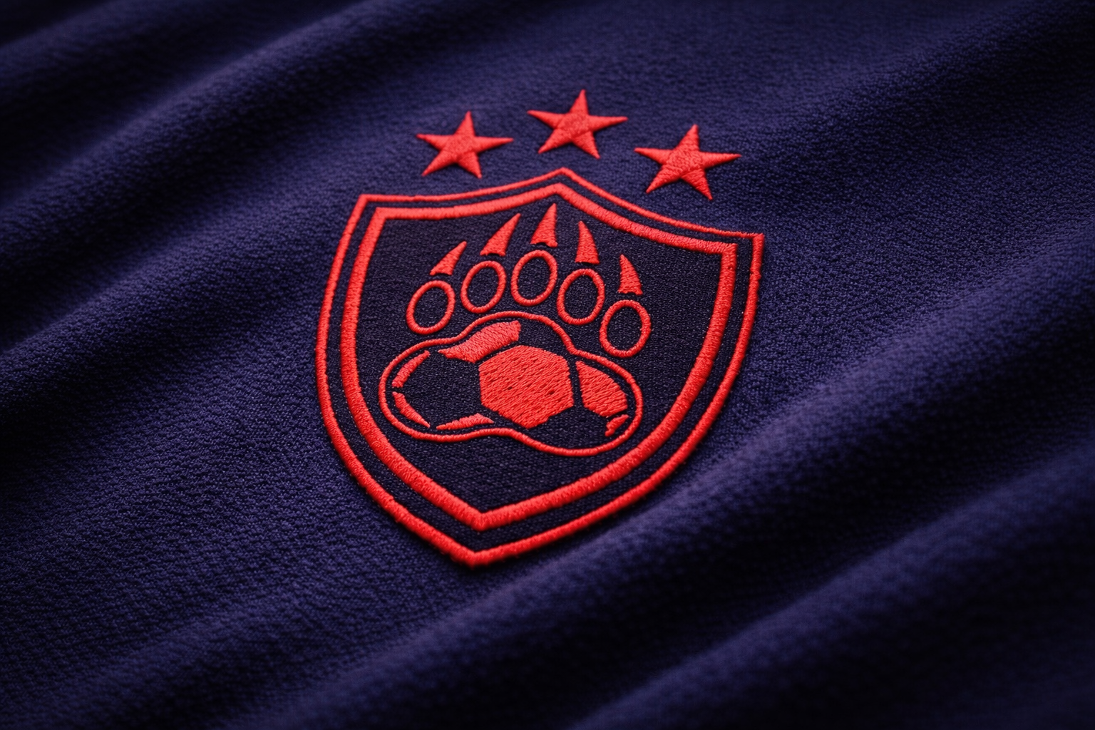
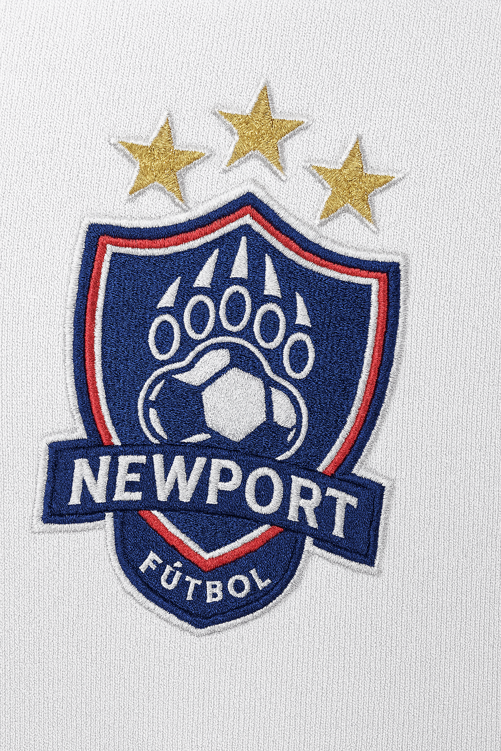
New crest deployed across patches, apparel, and webstore
Embroidery-first geometry and star hierarchy
Identity system extended into merch and digital
Outcome
Design Goals
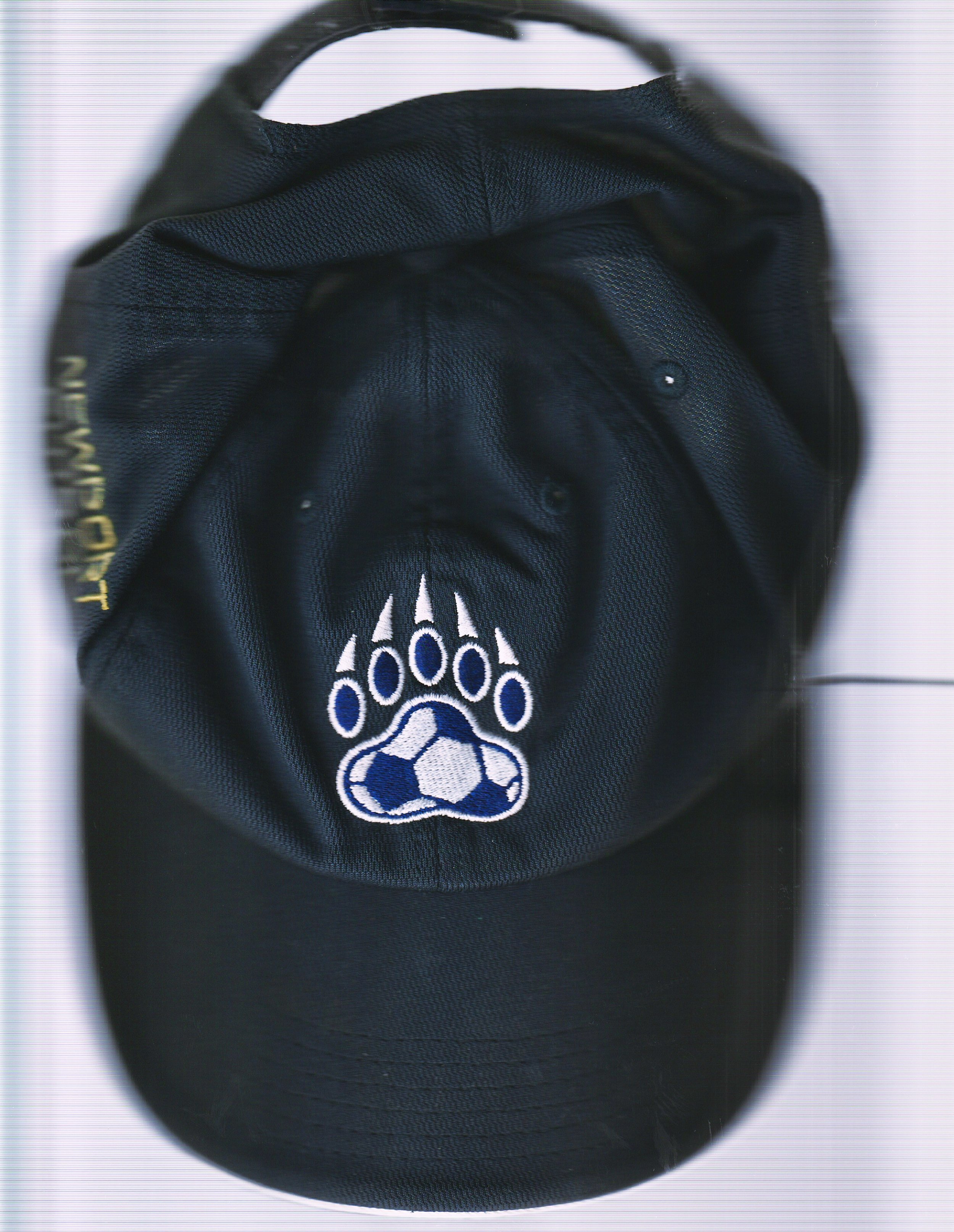
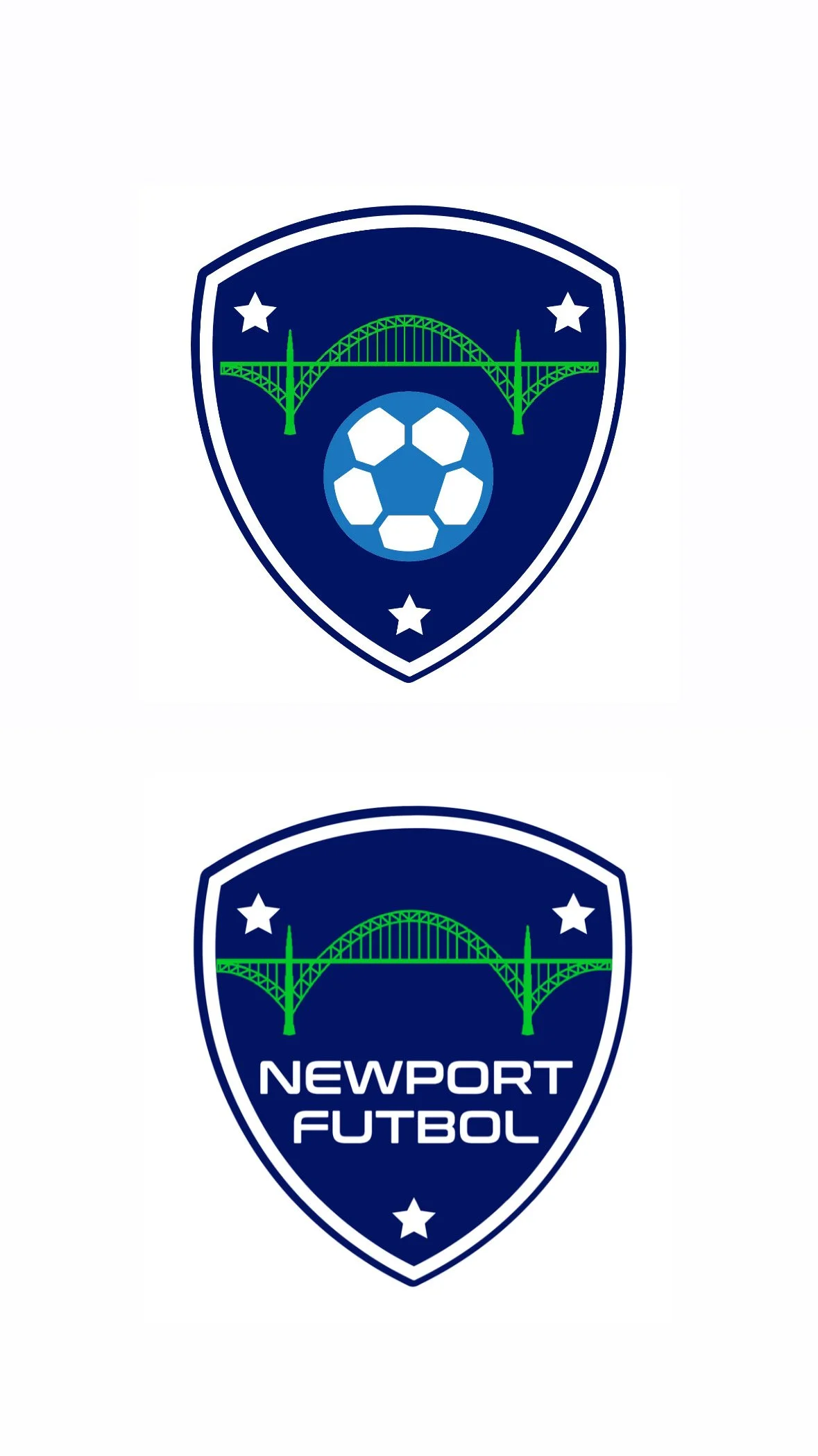
Original Crest
• Lacked hierarchy
• Inconsistent details
• Dated typography
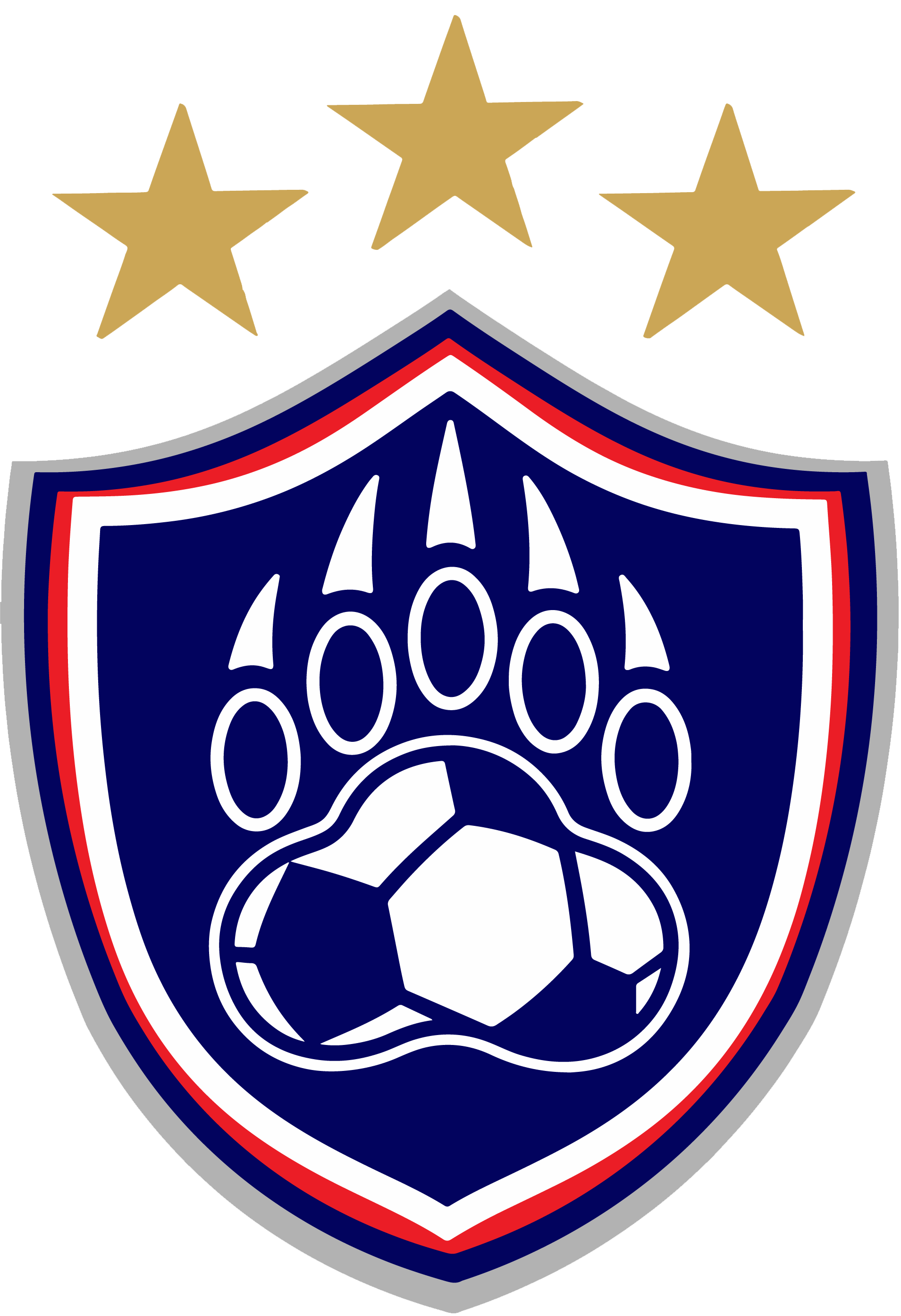
Redesigned Crest
• Refined shield and paw
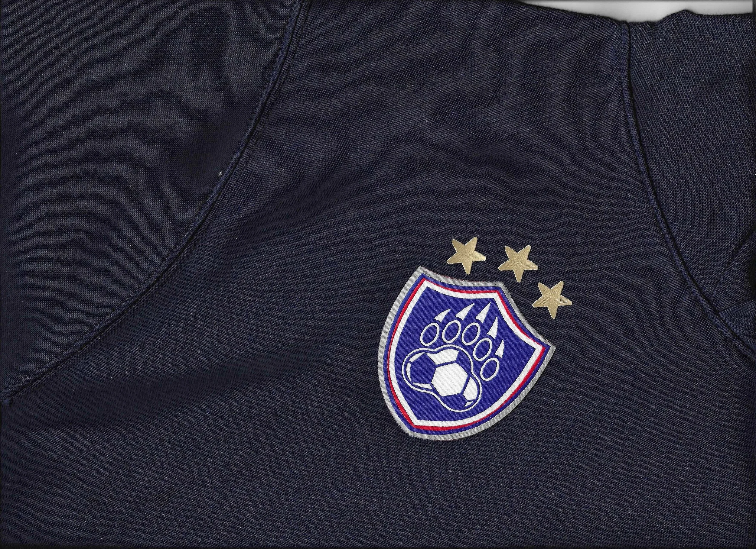
• Three-star system
• Optimized for small
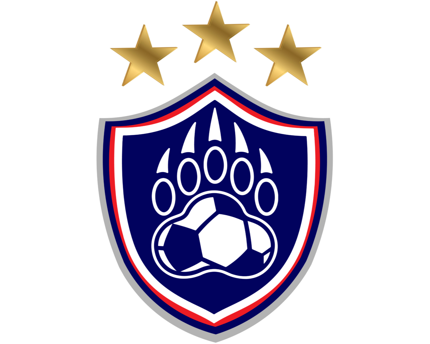
FINAL CREST
Logo History & Evolution
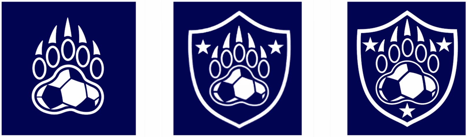
Shield added, 2 stars
Final crest
2018
Paw mark
2016
3 stars
2024
2023
Progression from 2016 to 2024.
3 stars mark titles in 2016, 2017, and 2023; shield and paw stay consistent while the form is refined.
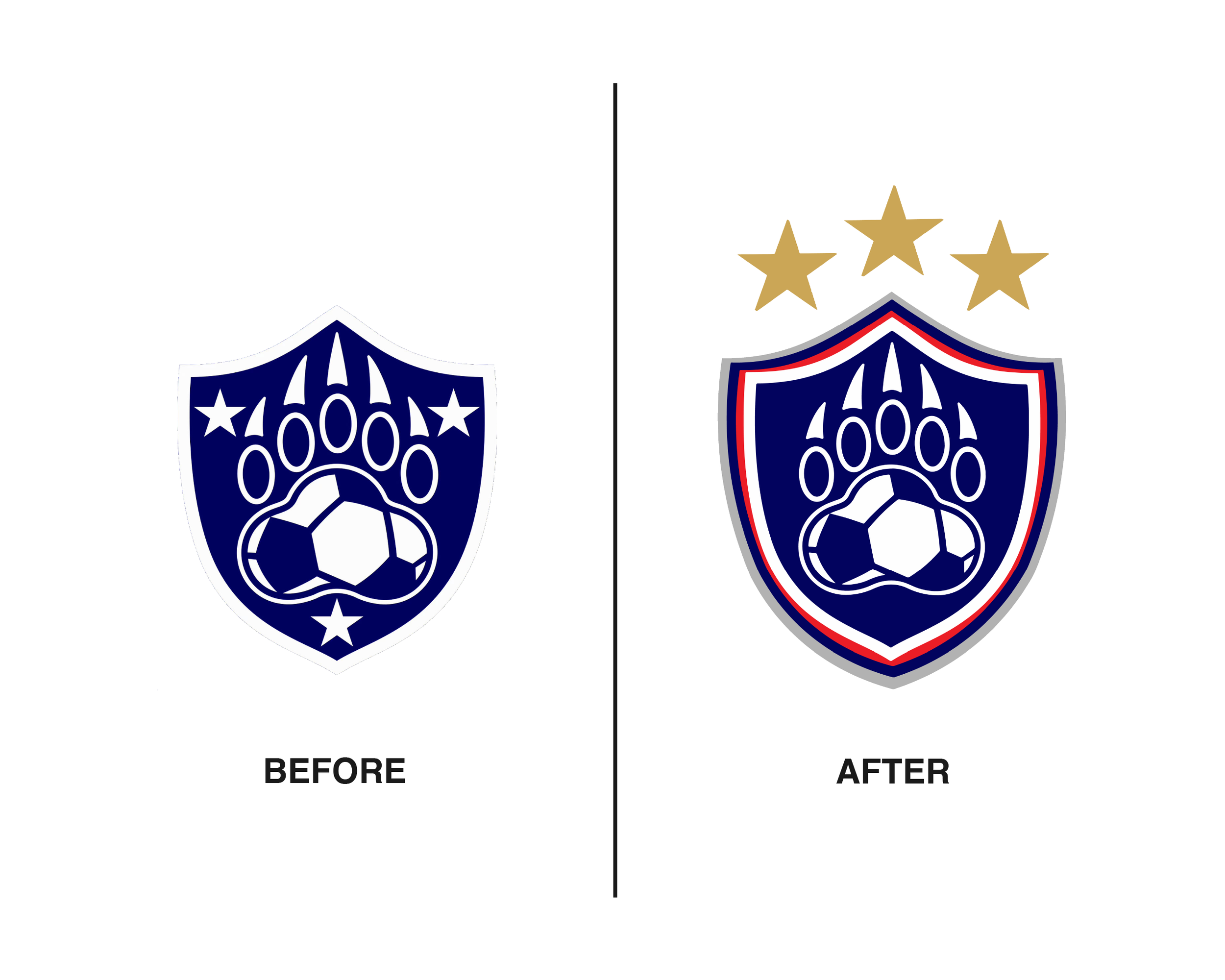
Before & After
The original crest lacked balance, clarity, and distinction. It relied on generic symbols and an uneven silhouette. I restructured the mark using a modernized shield, geometric spacing, and a new crest hierarchy that highlights Newport’s legacy. The redesigned identity features custom iconography, simplified forms, and a sharper sense of proportion. Every element was rebuilt with intention, from the bear paw to the star system to the vector precision.
- state titles (2016, 2017).
Symbol of pride.
- professional club motif, balance and protection.
- core symbol of identity, strength, and team unity.
The original crest was fine, but lacked the acknowledgement of the club’s history and hierarchy.
The redesigned version introduces three championship stars, refined outlines, and enhanced contrast-bringing new energy while staying true to the program's roots.
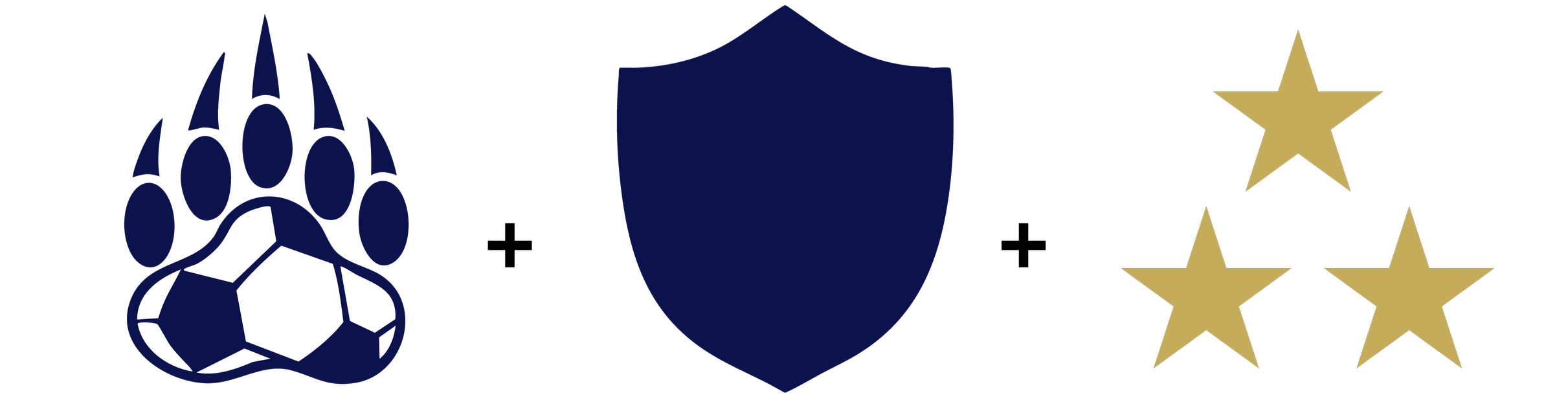
Logo Construction
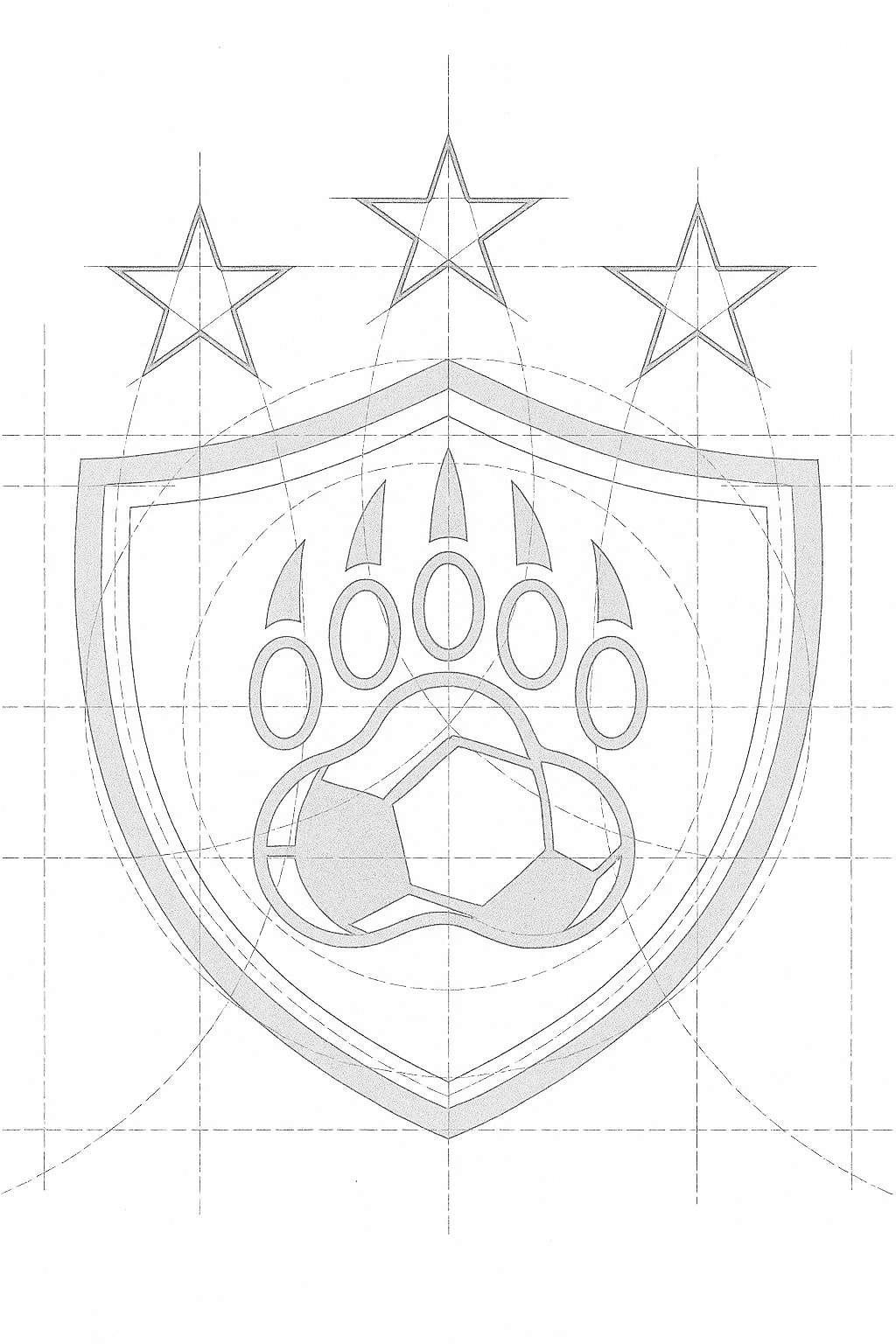
The crest is built from three parts: the paw mark, a modern shield, and three stars. A simple grid sets proportion so the mark holds together at patch size, on jerseys, and on the web.
Newport Cub Paw
Shield
3 Stars
Core parts that build the Newport Fútbol crest.
Sketches & Process
Every element was built with intention. I started with pencil roughs to lock the paw and shield language, tested star spacing and hierarchy, then moved into vector to set geometry and proportions. Early stitch tests confirmed the line weights and counters would hold up in embroidery.
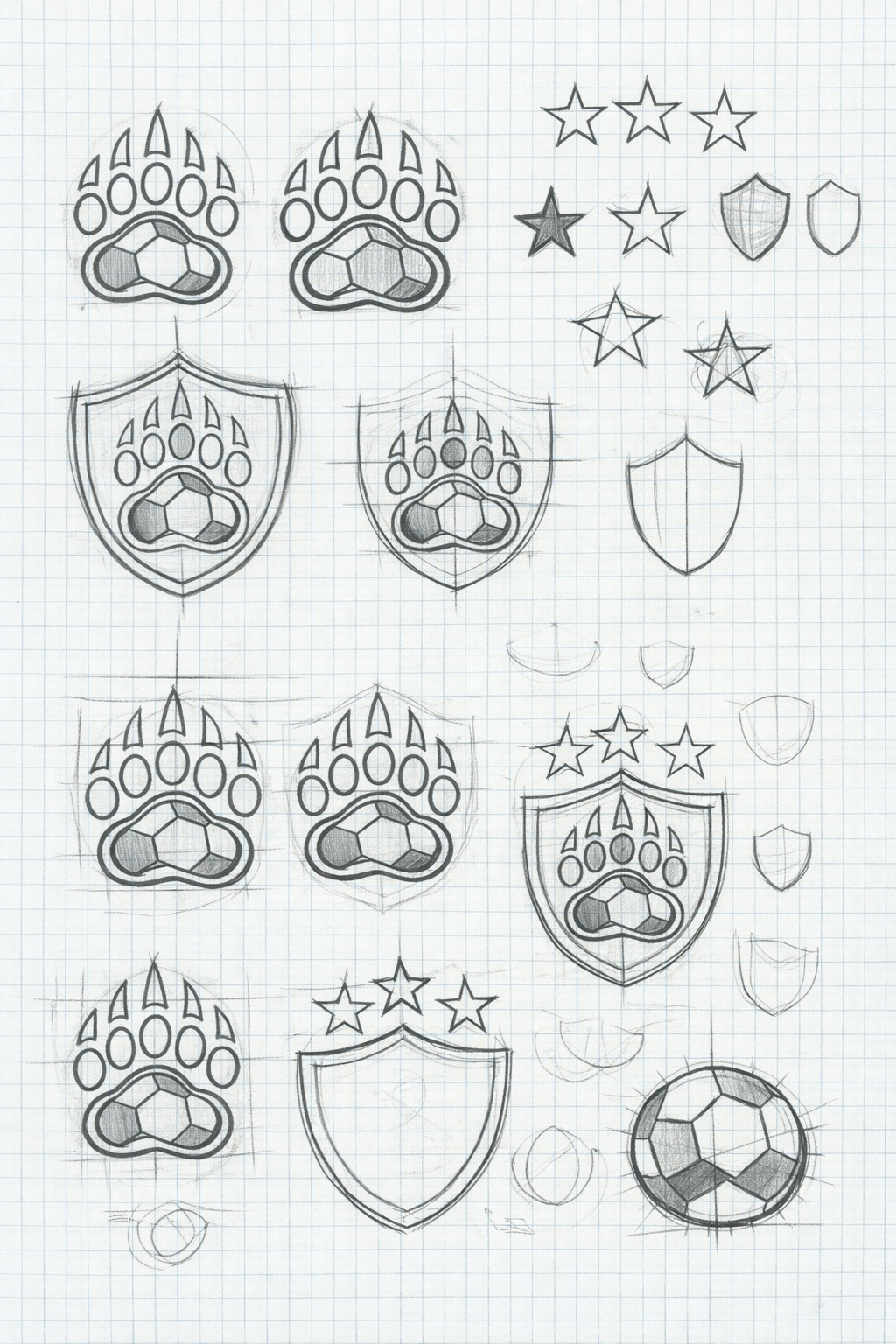
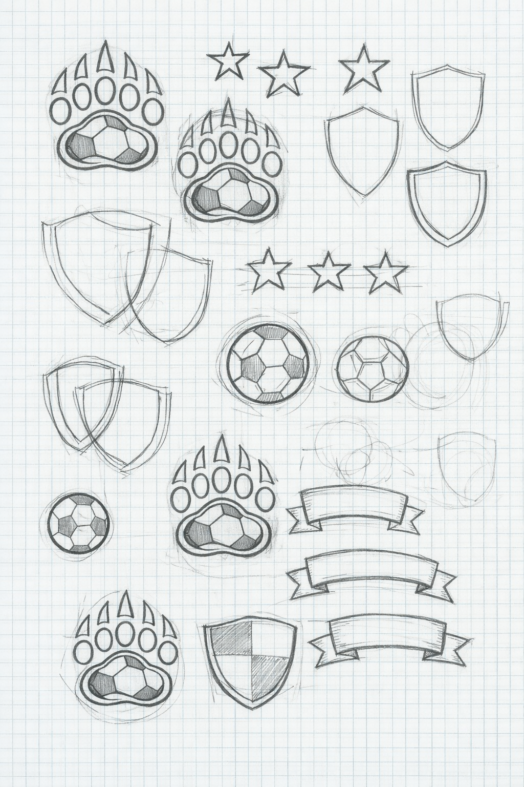
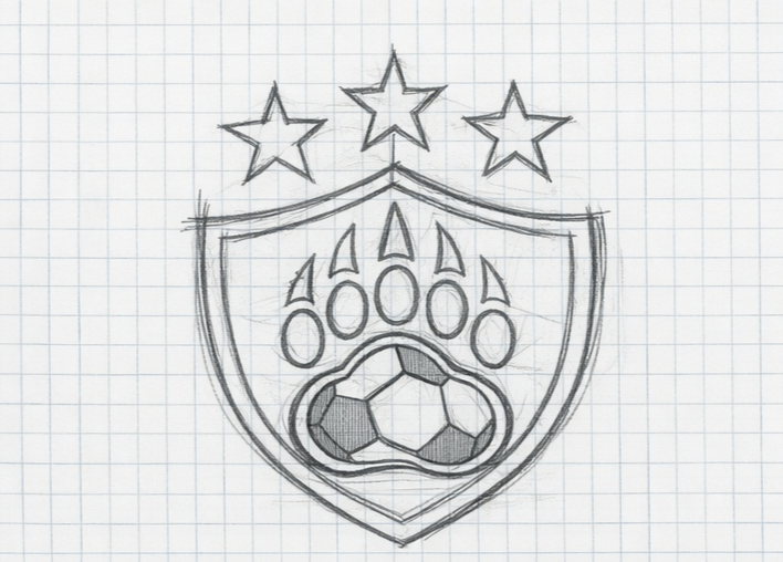
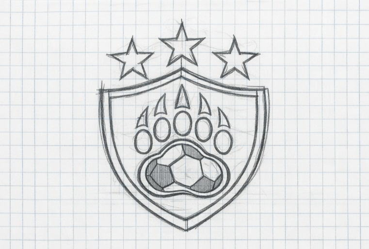
INITIAL SKETCHES
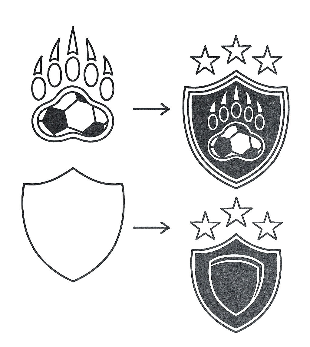
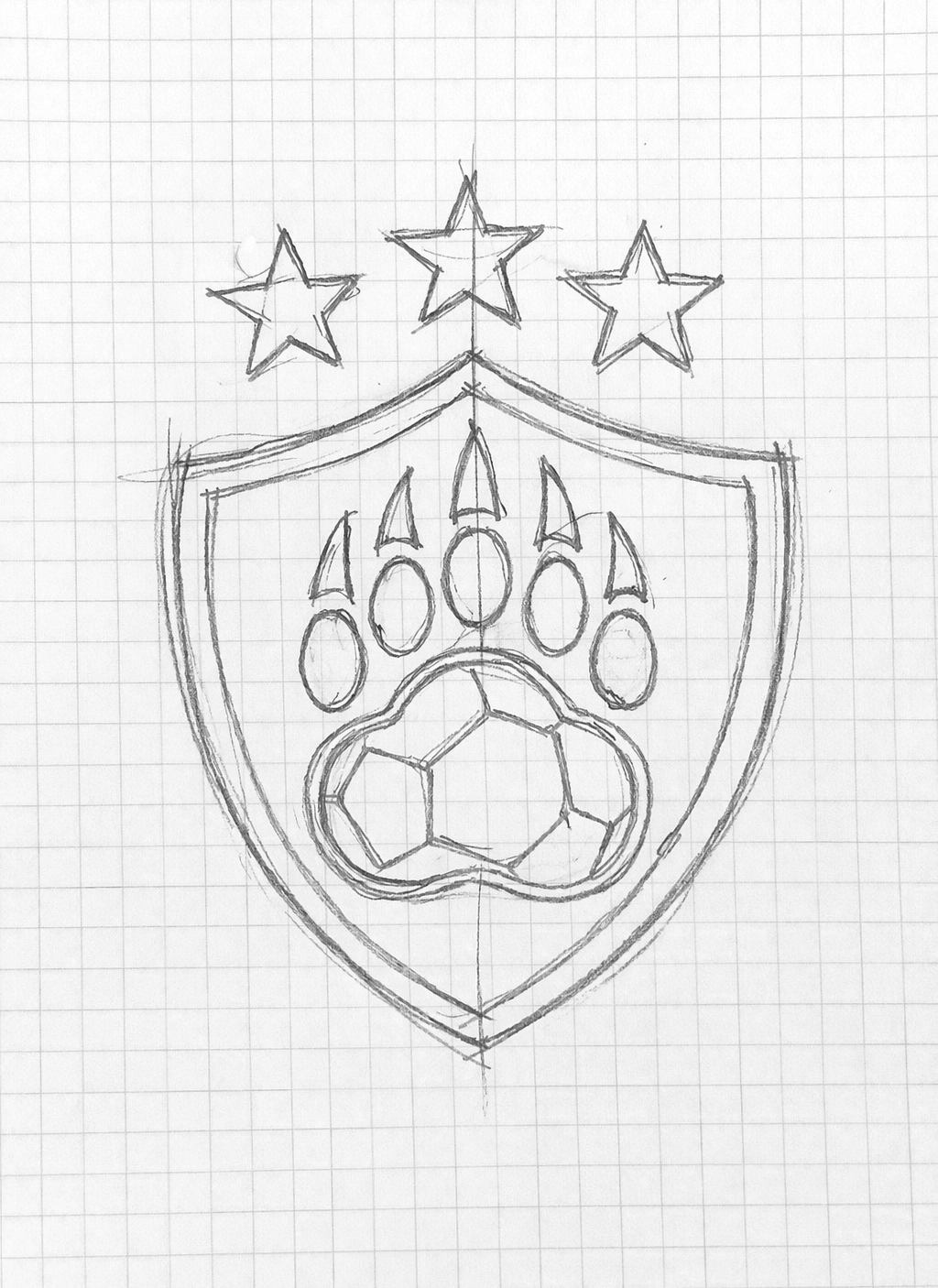
FORM DEVELOPMENT
VECTOR REFINEMENT
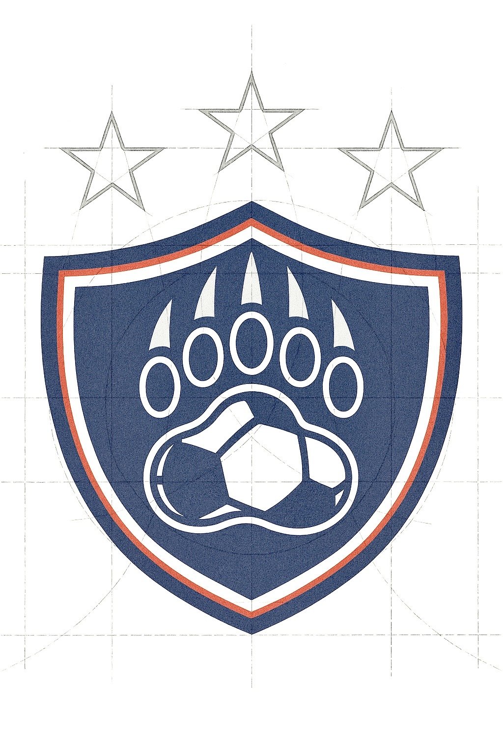
FINAL CREST
Color System
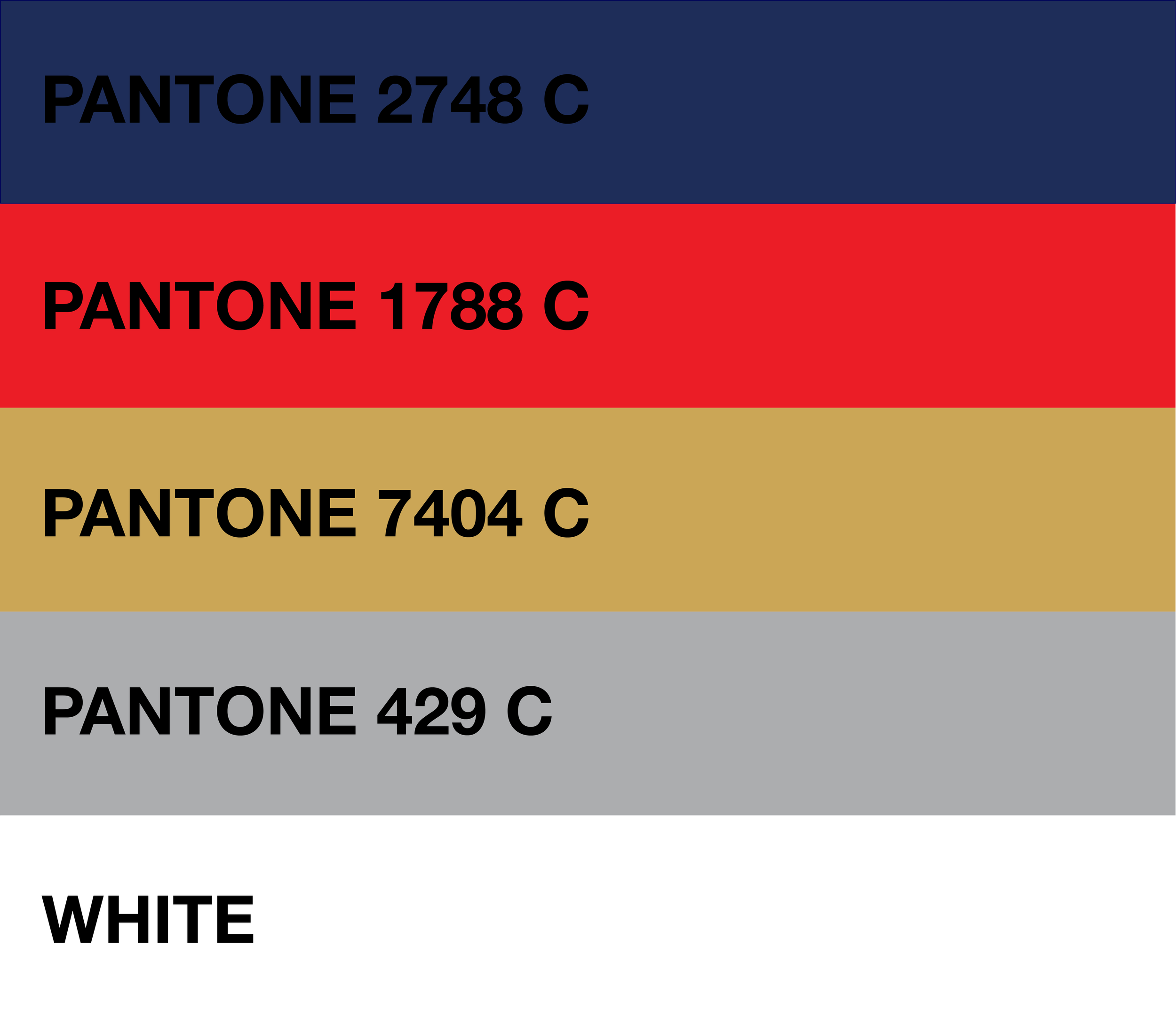
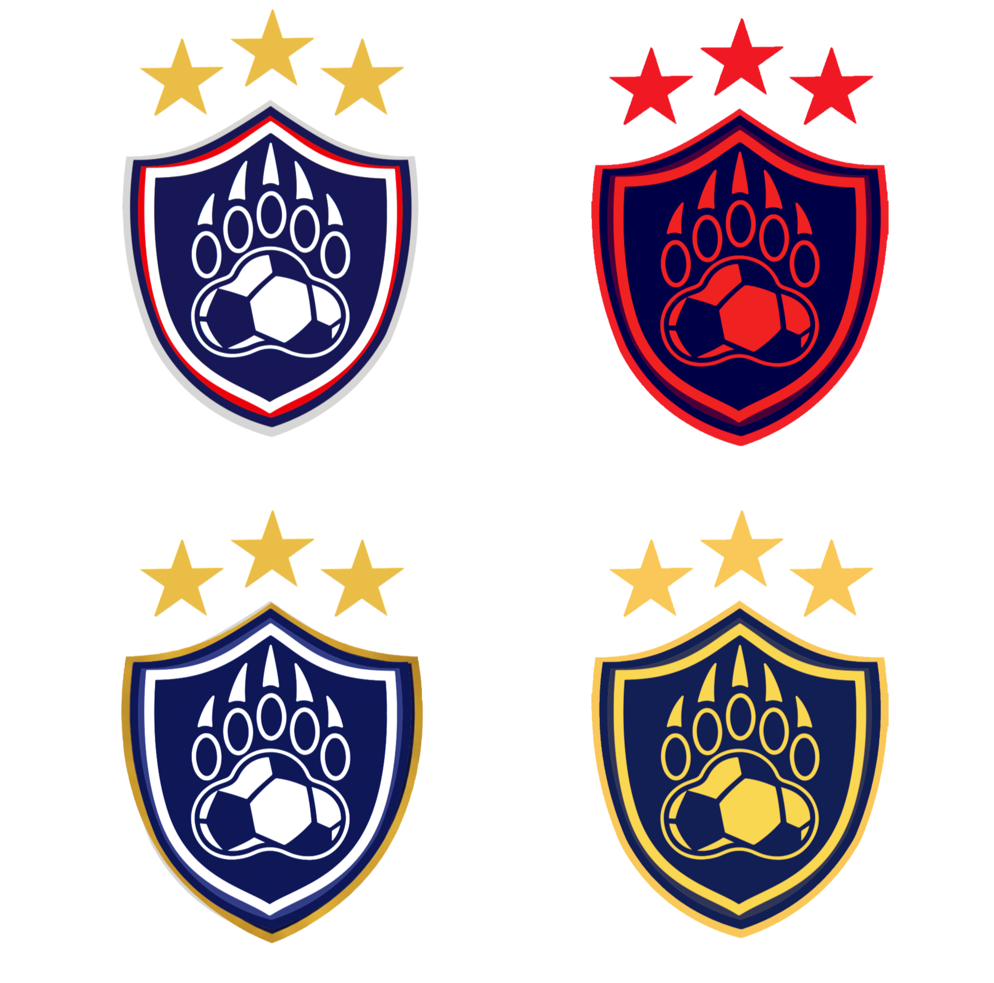
The updated color palette was built around Newport’s existing school colors but refined for clarity and contrast. Deep navy and bright white create a clean foundation, while red and gold accents add energy and prestige. Each color was tested for embroidery and screen printing to ensure accurate reproduction across materials.
Crest Variants
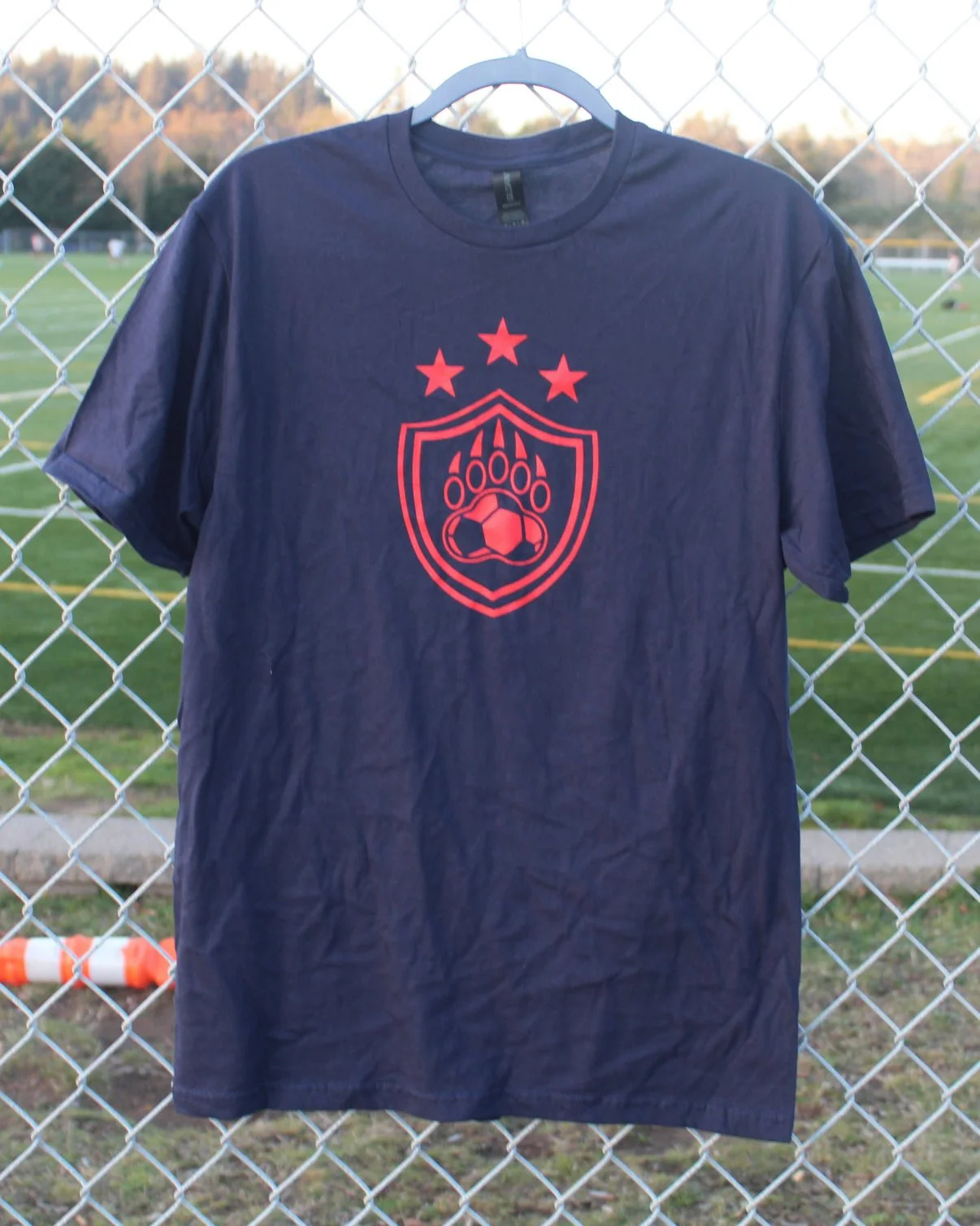
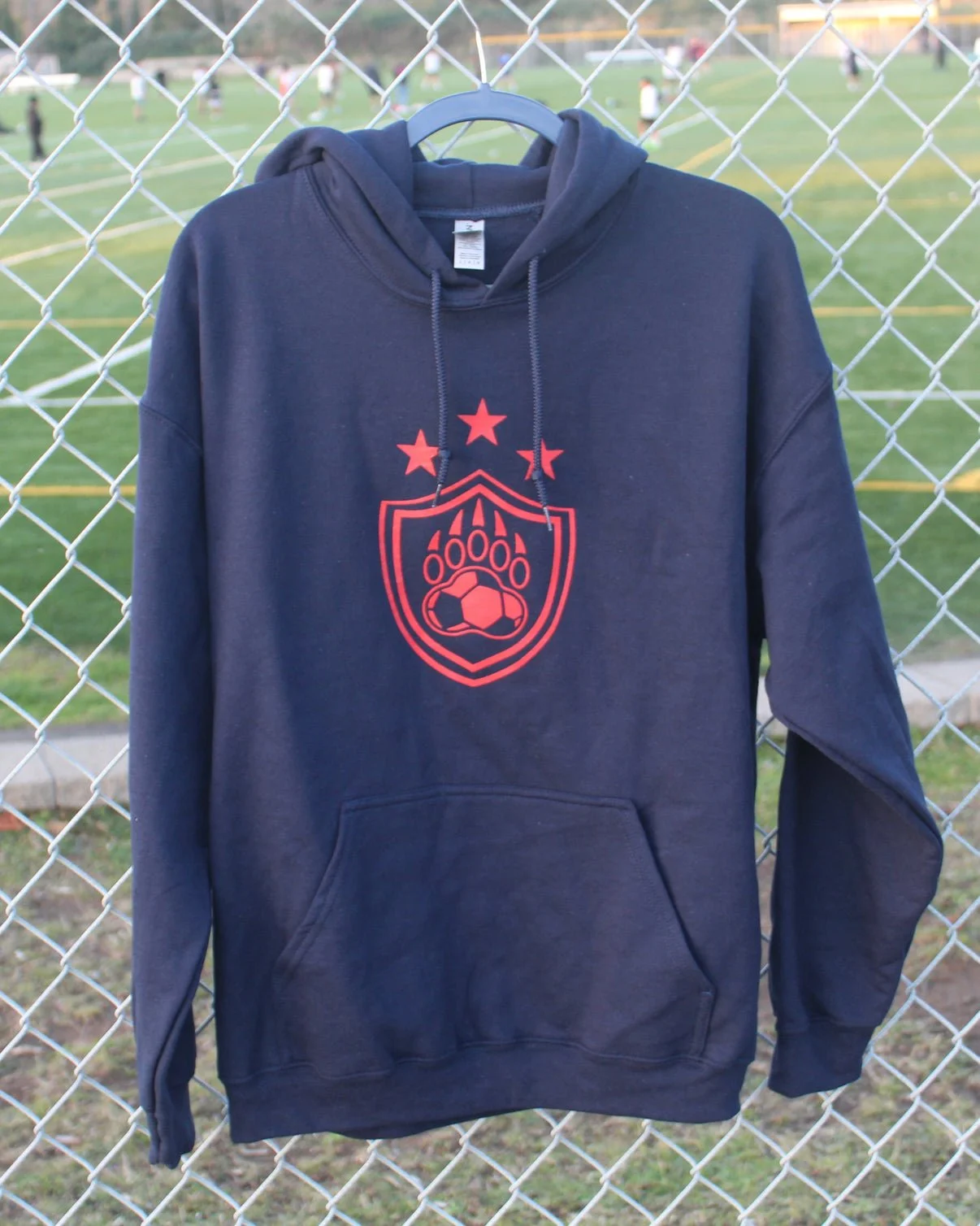
Multiple crest variations were developed for different applications and production needs. The full-color primary mark is used for digital and high-impact apparel, while simplified one-color versions are used for embroidery, screen printing, and secondary branding. Each version was tested to maintain integrity at various sizes and materials.
Real-World Application
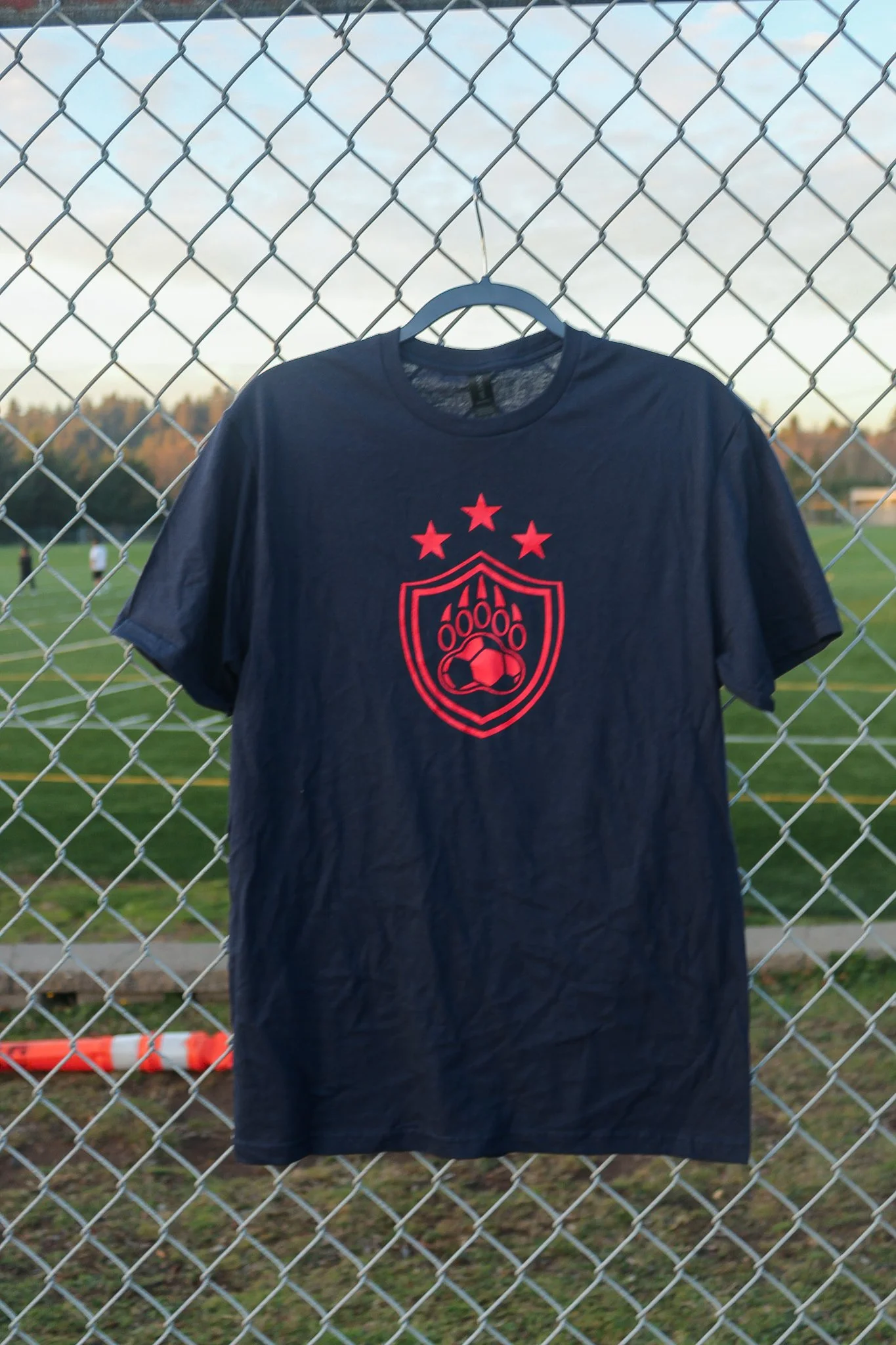
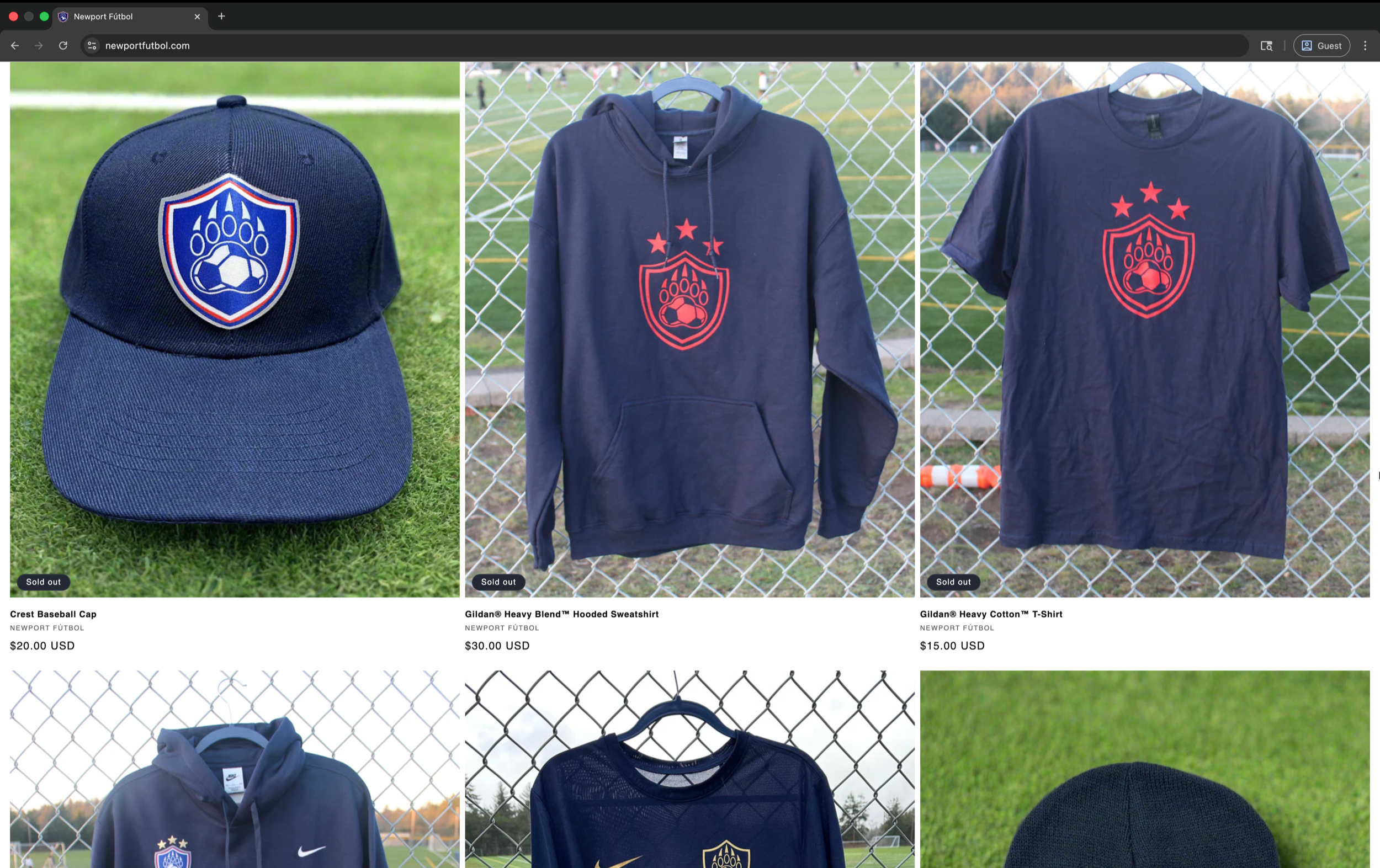
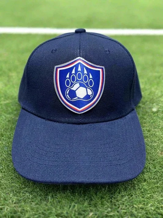
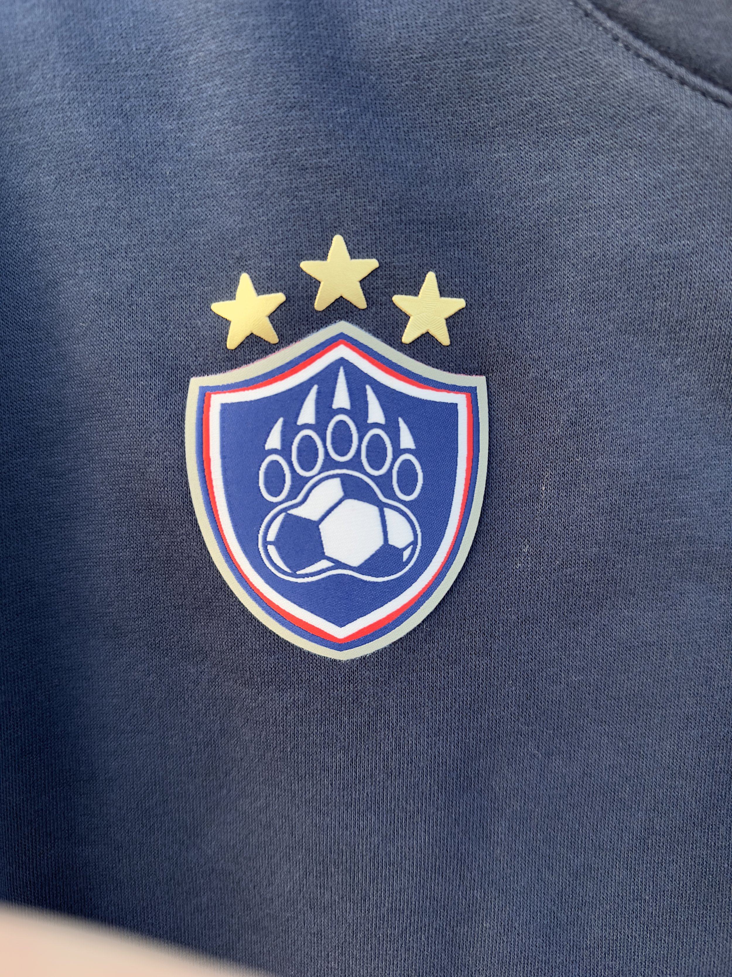
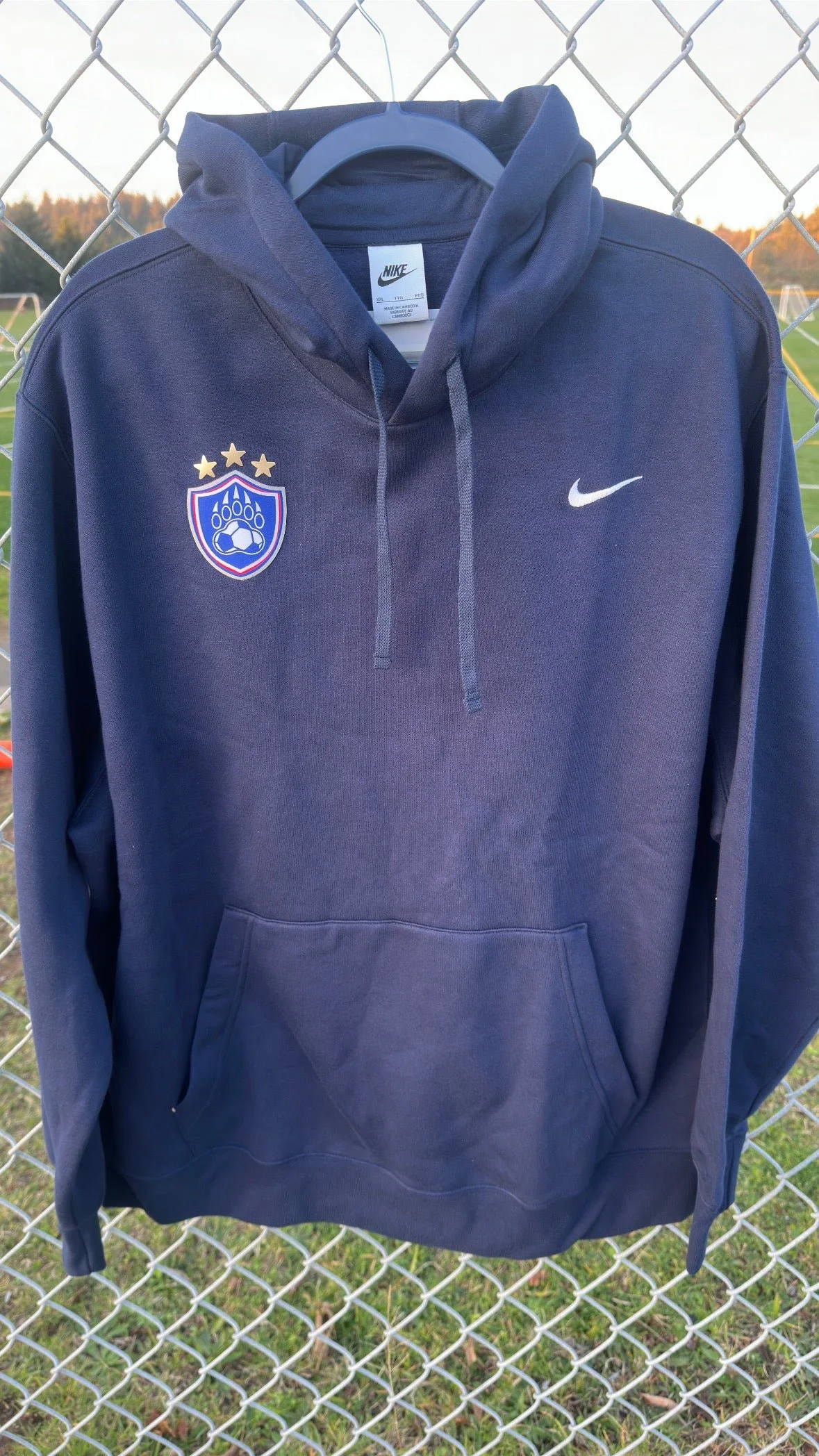
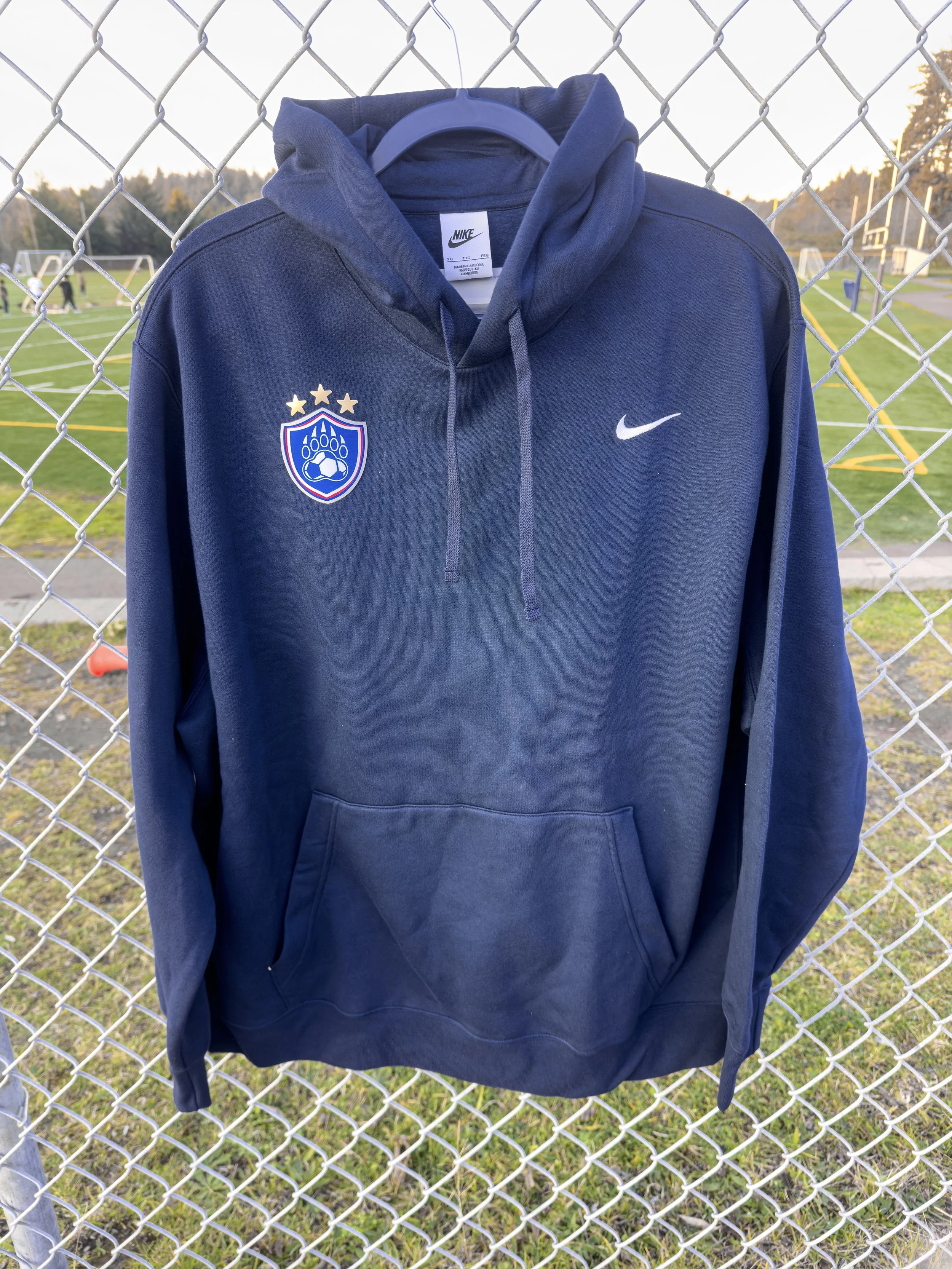
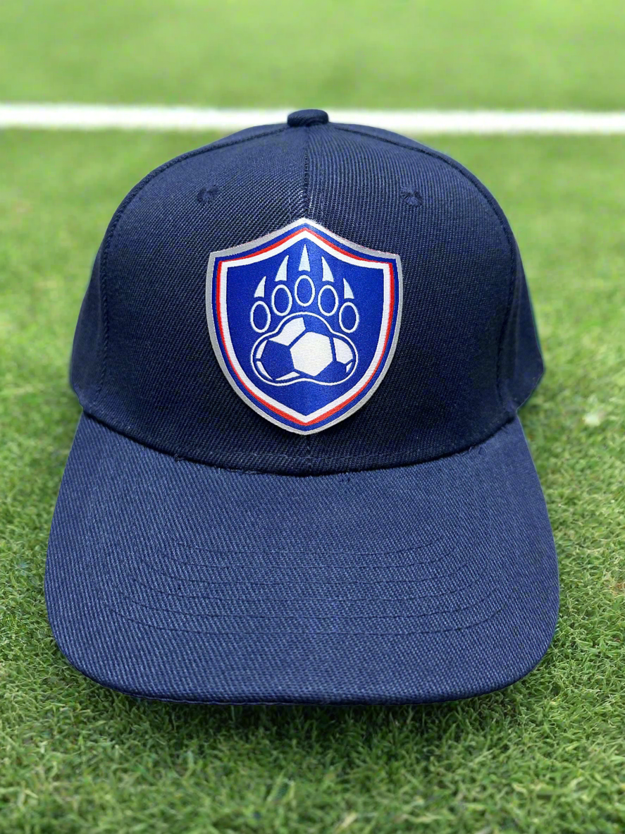
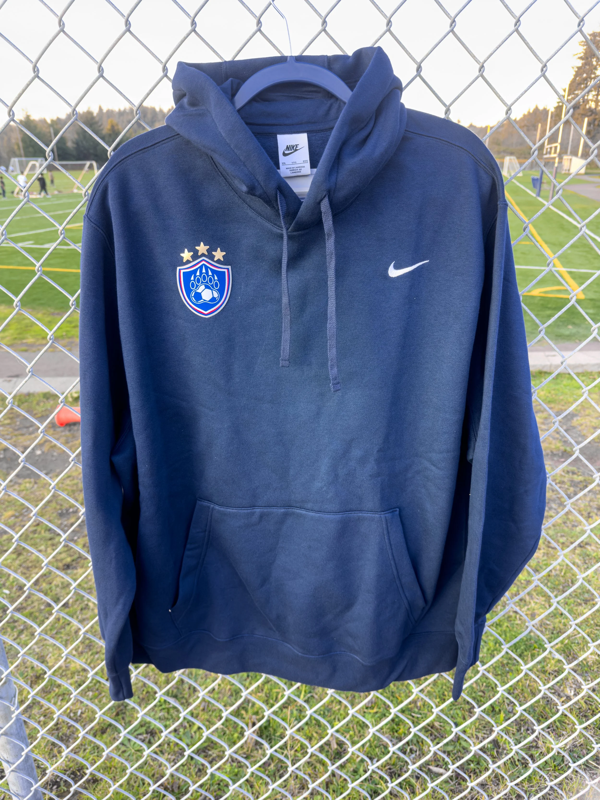
The final crest system was applied across apparel, packaging, stickers, and digital media to bring the identity to life.
Key placements included embroidered hoodies, Nike-branded training jerseys, printed hang tags, and team merchandise.
The mark was designed to scale naturally across formats without losing its presence or clarity.
Unused Concepts
A few early directions helped define the boundaries: circular badges, monoline paws, and star rings. They were set aside for clarity at small sizes, a stronger competitive voice, and a more distinct silhouette.
Final Notes
This project was about more than just a redesign. It was a chance to elevate a local program to a professional standard, blending storytelling, craft, and technical execution. The final identity gave Newport's players and community something to be proud of on and off the field.